
Colour Inspiration – What Shade To Use in your home?
Colour is an important factor when it comes to your home as it inspires all kinds of moods and atmospheres. So whether you’re completely redecorating of just looking to make a small change, you are going to need some colour inspiration.
Different colours can provoke different moods. This is important to note if you want your rooms to provoke these moods too. For example, your bedroom should make you feel calm and relaxed. In comparison, a living room or dining room should project a more sociable atmosphere.
Contrast yet compliment your colours by pairing warm and cool shades together. Rich orange warms up a chilly blue scheme, whilst fresh green will compliments a red interior.
Here is a breakdown of how some popular interior colours can affect our moods, hopefully providing you with some colour inspiration. If you are in need of a little bit more of a helping hand, then head over to Dulux’s Inspiration Gallery:
Finding Your Colour Inspiration –
Blue:
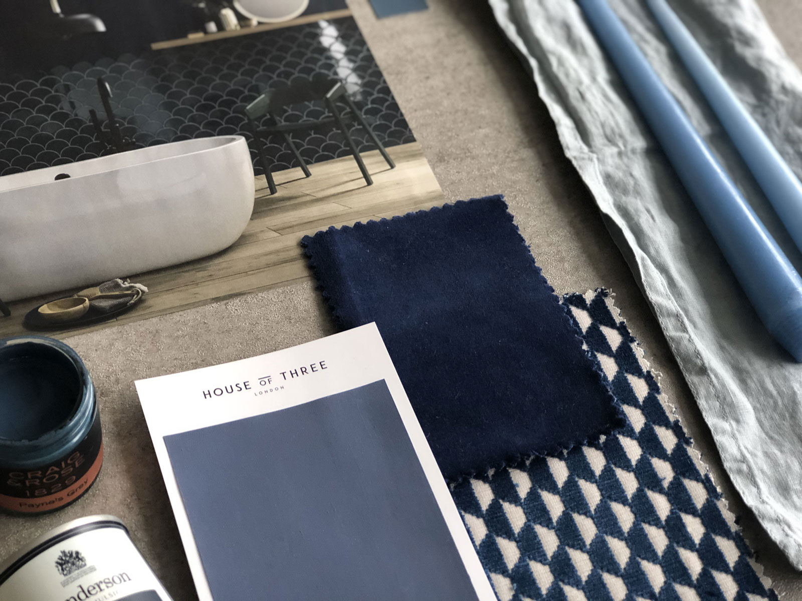
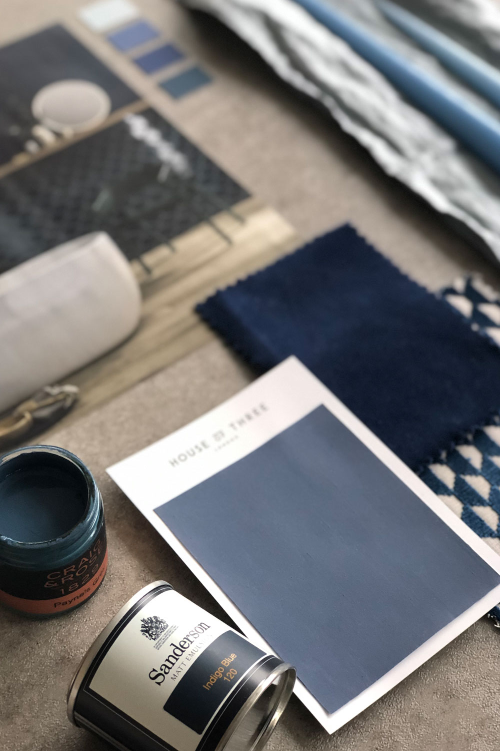
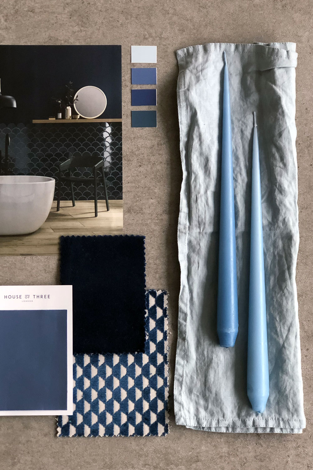
Blue is calming and serene, it can make you feel calm, centred and relaxed. It is also considered beneficial to the mind and body. Blue is also widely accepted by men, according to studies, therefore perfect in interior design in creating a space for both men and women.
Light blue is often associated with tranquillity, understanding and softness. In comparison, dark blues represent knowledge and power. Blues are also good to help clear the mind and steady the breathing. This therefore makes blue rooms lovely to lounge and rest in – perfect for a living room or bedroom. Whilst pastel blues can come across as chilly, you can still pair light, tonal shades of this colour with warm hues and furnishings to create an easily balanced interior.
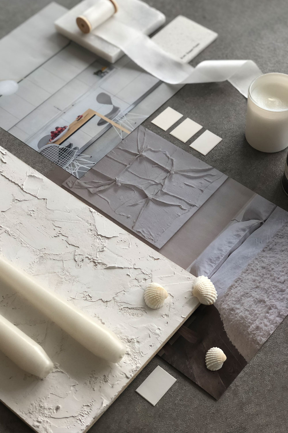
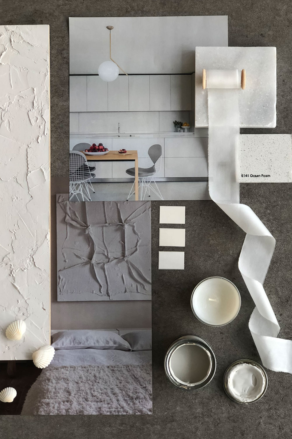
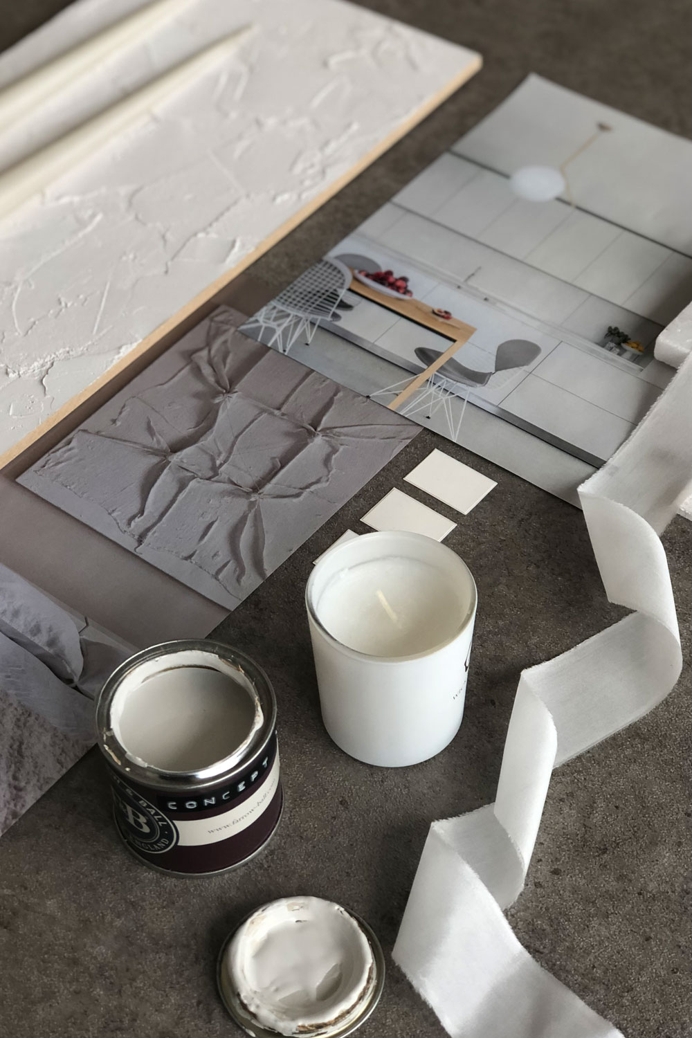
White:
White is timelessly popular in interior design – the perfect colour inspiration. It has positive connotations and depicts coolness and cleanliness. This makes it perfect for a guest room or bedroom as the colour white stands for protection and goodness.
By painting your walls white, or off-white, it is a great way to help your home feel more spacious and open. Neither a calm inducing colour or necessarily energetic, white provides a happy medium that leaves people feeling clean. It is also a popular colour to pair with other neutrals, such as browns, greys and woods textures. This will create a gorgeous Scandinavian style room.
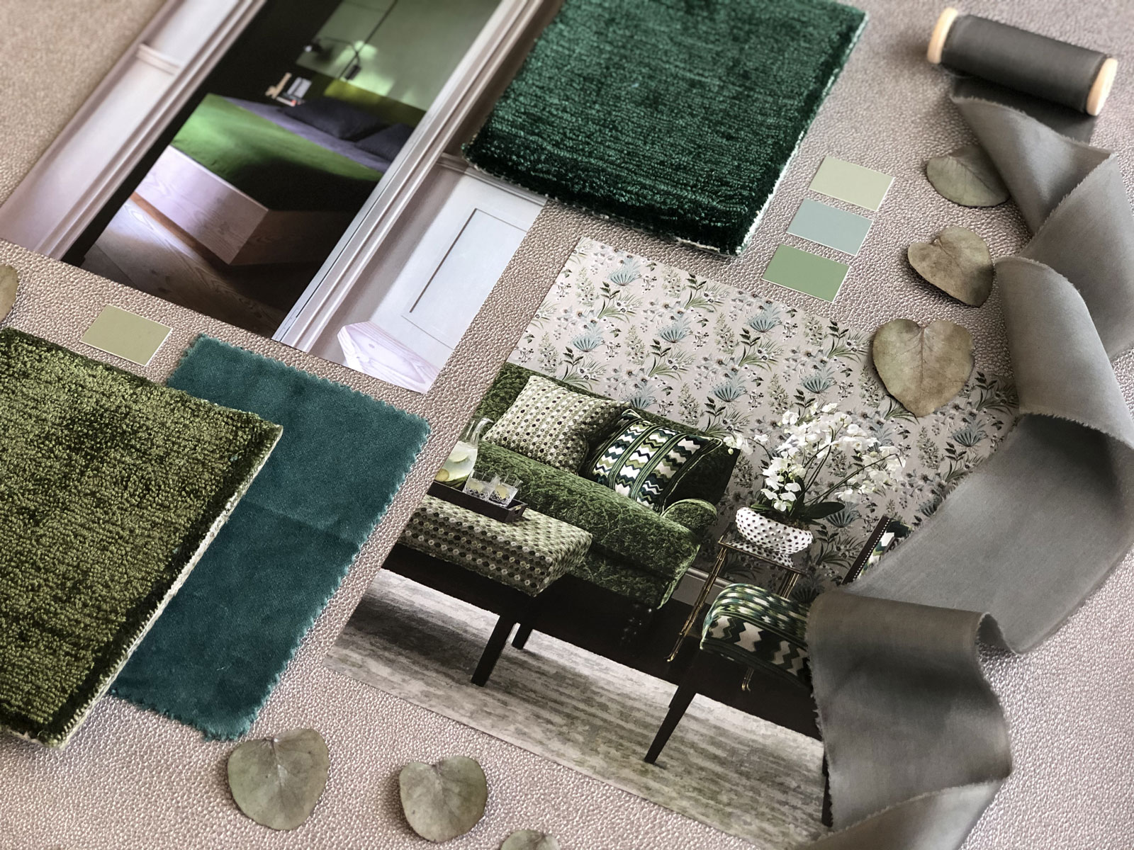
Green:
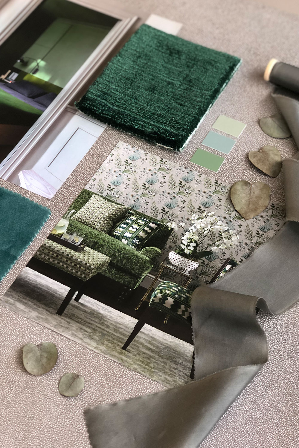
Green is great for a home office. It symbolises prosperity and helps to reduce anxiety. It is also one of the most restful colours for your eyes and is known to be mind-clearing. This makes it perfect for when you are sat working. Green is also the colour of nature and can be incredibly calming. It’s easy to introduce into a room, just with the addition of a plant.
However, green can inspire different moods with different tones – For example, dark green is the best at creating a moody, nature inspired vibe. My personal favourite is aqua which is associated with healing and protection.
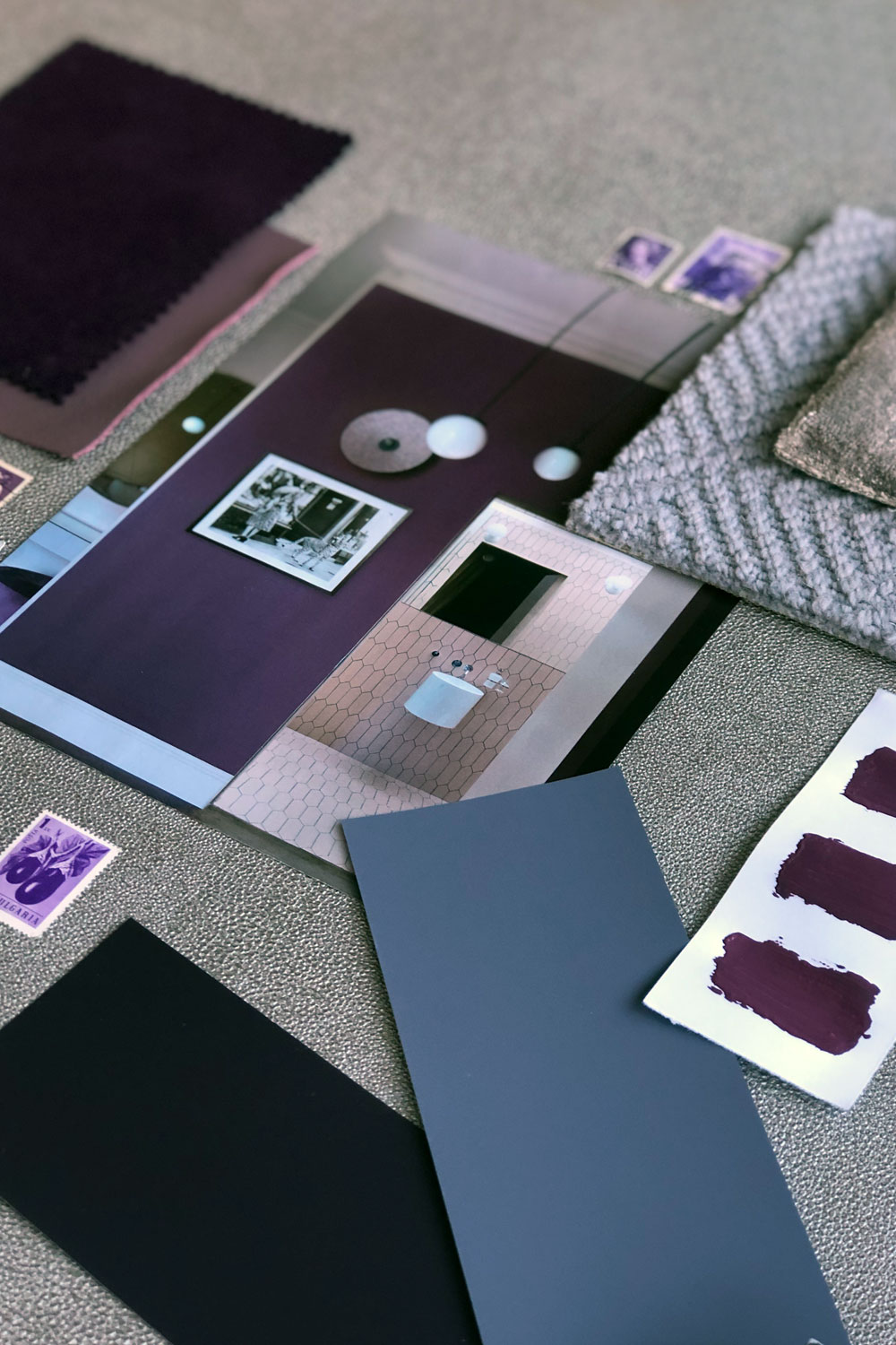
Purple:
Purple is a rich, dramatic colour that is associated with luxury. It gives off a very romantic, mysterious vibe, great for sparking creativity. Deep purple can be great in living rooms paired with rich velvets and greys to fully complete the luxurious mood.
In comparison, deep purples aren’t great for the bedroom. As a stimulating colour, it isn’t best to introduce them into a room where you want your mind to relax. However, lighter purples, such as lavender and lilac are better colour inspiration for your room as they are calming and light.
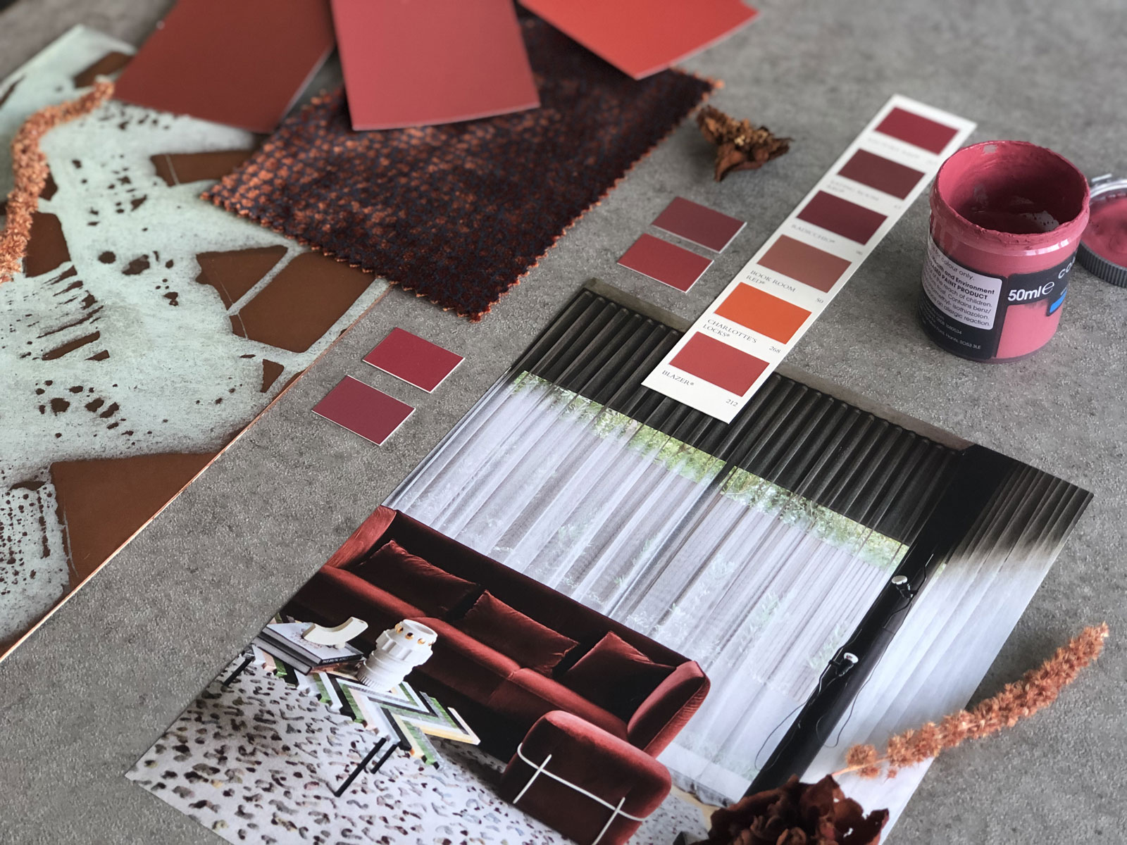
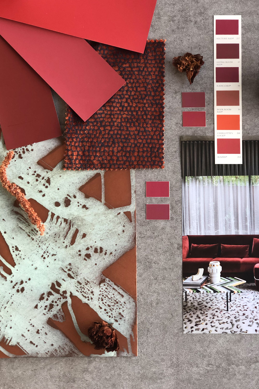
Red:
Whilst red leads to ideas of romance and roses, it is also a great colour for socialising. Use it in rooms such as your living room or dining room, social rooms as opposed to rooms that are meant for relaxing.
It is great, especially around Christmas, for inspiring a festive, sociable mood, and allows gives a luxurious feeling if paired with velvet fabrics or gilded finishing’s. I personally like combining reds with similar autumnal colours, such as oranges or browns, and woody, hunter greens, to create a moody, outdoorsy feel.
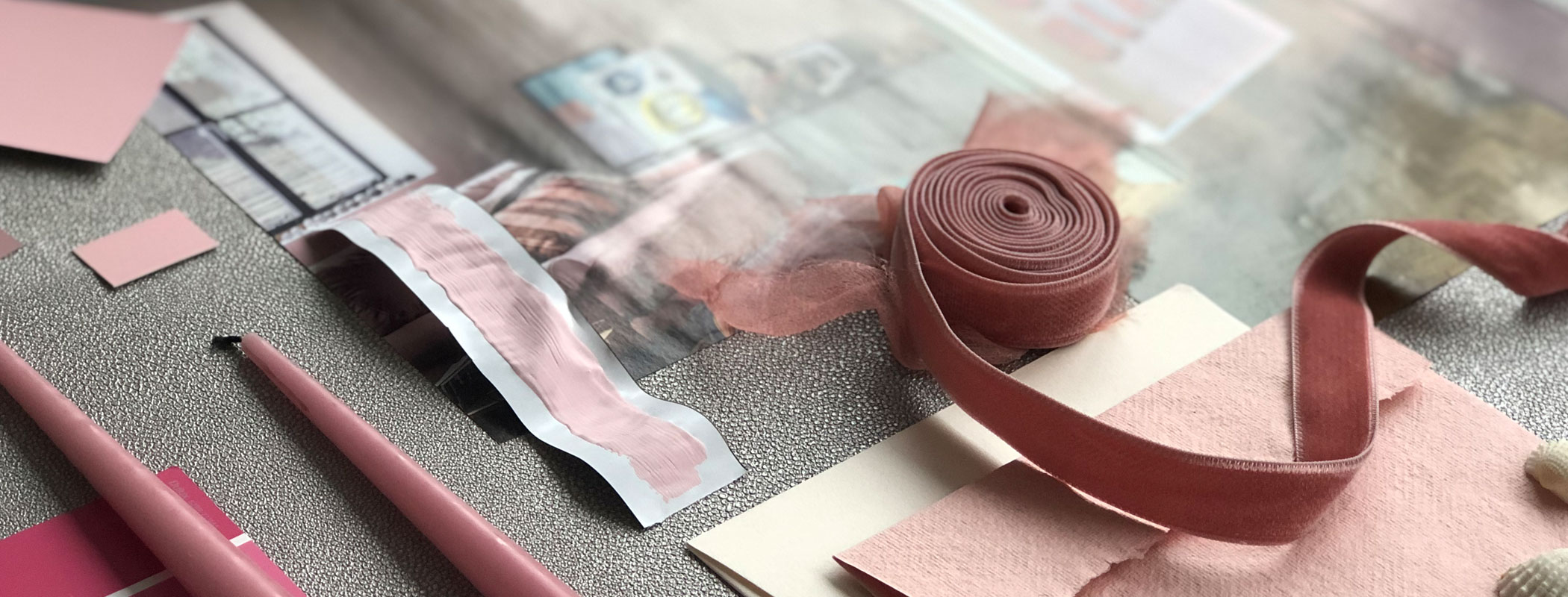
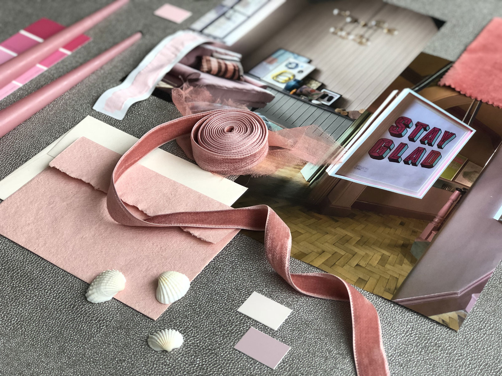
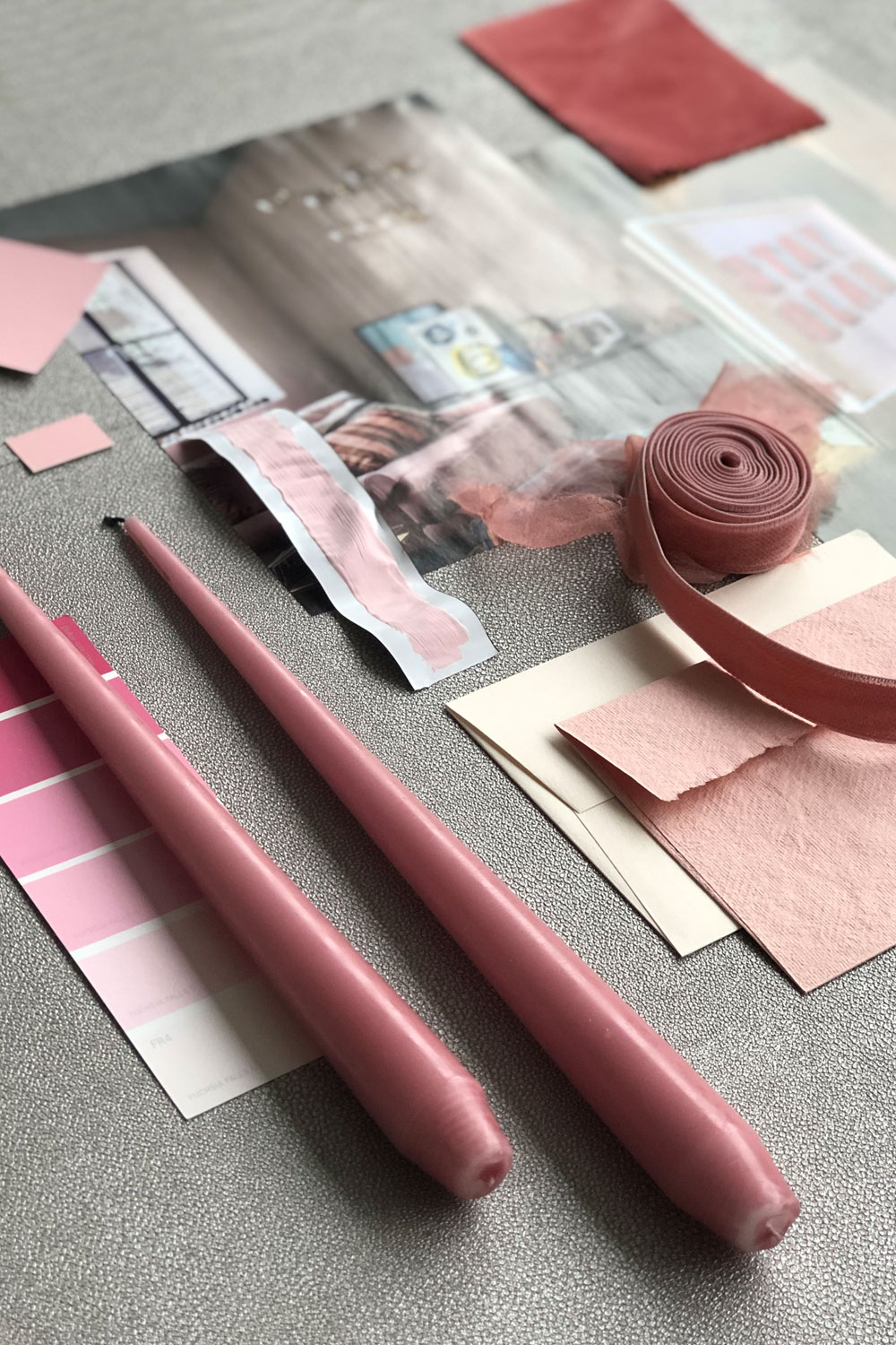
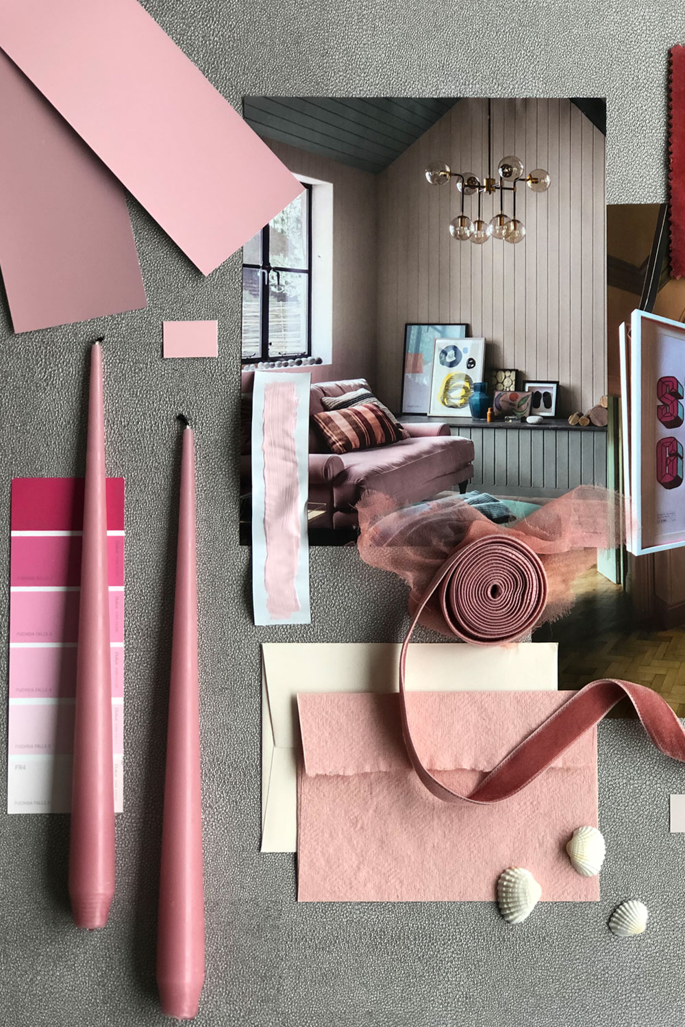
Pink:
Whilst red can be stimulating, pink is the opposite – the longer you are exposed to it, the calmer you will become. This is known as the ‘Pink Effect.’ Whilst this might work differently for bright magenta pink, for tonal pinks, such as blush, raspberry or similar shades, it creates a calming atmosphere.
Pink is also popular and can create many different atmospheres. Paired with mother-of-pearl accessories and velvet it can be luxurious. In comparison, pair it with light greens to create a colourful, nature inspired space.
Deep purples aren’t great for the bedroom as they are a stimulating colour. However, lighter purples, such as lavender and lilac are better as they are calming and light.
So now you have an understanding of what colours to use to inspire certain moods. However, you may still want some guidance on applying these colours. When it comes to finding your colour inspiration, you want to consider the Colour Wheel. On the colour wheel you have 12 hues – your primary colours, secondary colours and tertiary colours (made by mixing a primary colour with a secondary e.g lime green, turquoise, peach etc). There are endless tints, shades and tones made through different combinations, but everything stems for the same primary colours.
So what colour goes with what?
Applying Your Colour Inspiration –
Monochrome:
Contrary to popular belief, monochrome isn’t black and white. Instead it is mono-chrome, or one-colour. A monochrome scheme is easy to create in your interior and can create a strong atmosphere. The key to a perfect monochromatic scheme is to incorporate different tones and tints of the colour. This will keep it interesting and make using bold or contrasting patterns easy as you match by colour.
However, if full monochromatic is too overpowering, then opt to mix in some subtle neutrals such as white or grey, or some finishes like wood or metal.
Harmonious Colours:
Harmonious colours are 2 or more colours that sit side by side on the colour wheel. These are typically colours that stem from the same family, therefore work well together, even if they contrast slightly. For example, pair blue with violet or yellow with green.
This works particularly well with bright colours. The intensity of the colour is bold enough that you don’t need a strong colour clash. The key here is to keep the same tone and balance the colours with large areas of white to keep things fresh.
Complimentary Colours:
Complimentary colours are great colour inspiration! Opposite each other on the colour wheel, they contrast yet compliment each other. I think this works particularly well when pairing warm and cool shades together. Warm orange warms up a chilly blue scheme, whilst fresh green will compliment a red interior.
Blue rooms are lovely to lounge and rest in – perfect for a living room or bedroom. Whilst pastel blues can come across chilly, you can pair light, tonal shades of this colour with warm hues and furnishings to create an easily balanced interior.
So there we have it! What colours inspire what moods and how to combine those colours within your space. However, when it comes down to it, you have to go with your gut and pick colours that work for you. I’d advise that you have fun creating a mood board for your space, collecting paint samples and colour swatches. Hopefully I’ve provided you with some colour inspiration, but fundamentally it all comes down to you. Eventually you’ll get a feeling when something looks great – that’s the colour for you!
Disclaimer – We always endeavour to credit the correct and original source of every image that we use. If you think that this credit may be incorrect, then please contact us at info@houseofthree.co.uk